The visual presentation of research results is an important part of scientific work. It makes science comprehensible to a wide audience and helps to communicate the research results in a way so that they can be applied in practice. For the Center for Health Services Research of Cologne (ZVFK) and the Cologne Research and Development Network (CoRe-Net), this is enough reason to offer a seminar on this topic for participants from various scientific institutions. .

Therefore, the one-day seminar ‘Visualise science better’ took place on 13th, 14th and 15th November 2019. The participants had the opportunity to learn about basic design principles and advanced methods for scientific visualisation. The seminar was led by Chris Spatschek, communicator and lecturer at the National Institute for Science Communication (NaWiK).
 The day began with a short introduction and discussion of the expected goals. Afterwards the participants were given an introduction to the questions
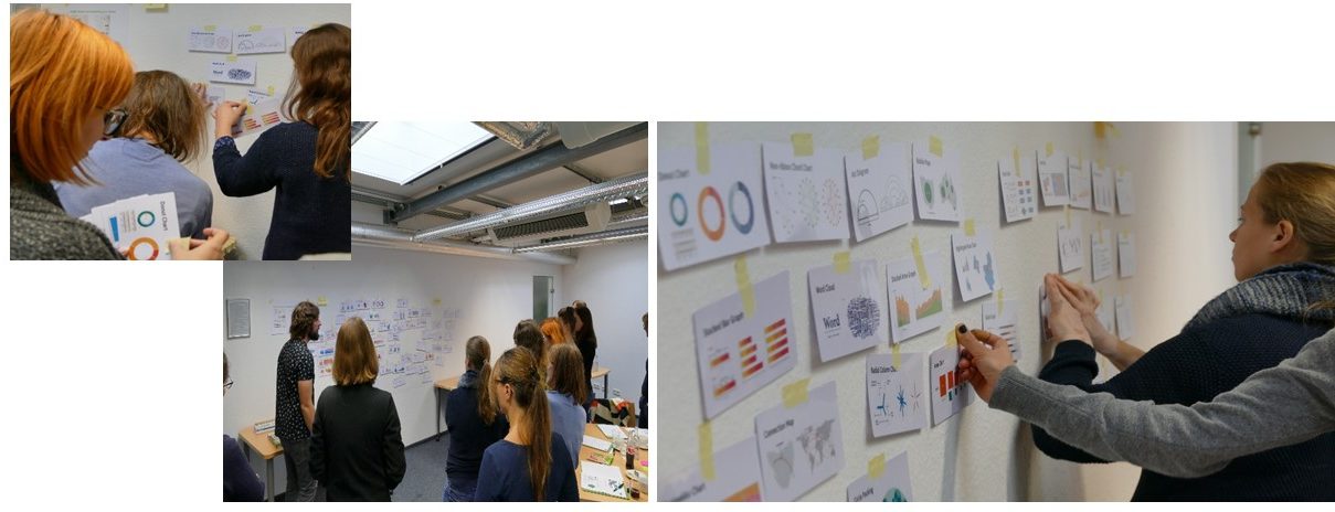
‘Why do we visualise’ and and ‘What makes a good graphic / design?’ . After a short break and refreshment, another short introduction to the basics of communication was given. This was followed by a practical part: formulating your own key message. This was followed by a discussion with a partner and feedback. Is the key message understood by everyone?
Chris Spatschek discussed how existing information can be structured in the best possible way and how a draft can be developed from this information. The last exercise involved sketching and designing his own infographics. The day ended with a question and answer session followed by a summary of the most important findings.


